Buttons
Inserting a Button
Buttons can be styled in a variety of ways to achieve the look required by modifying settings such as size, background/border-color, label color, border styles, and icons.
Related Video Tutorials
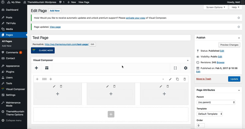
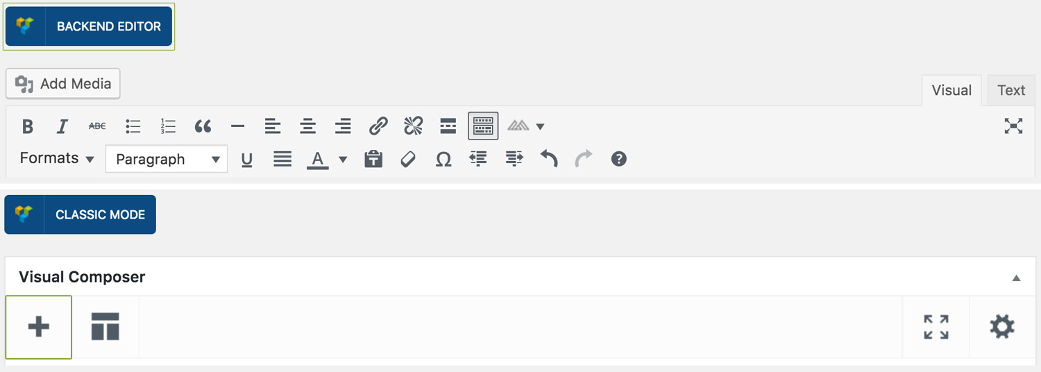
Step 1: Switch To Backend Editor
To insert a button, start by clicking the button "Backend Editor" button then click the "+"(Add Element) button, for example:
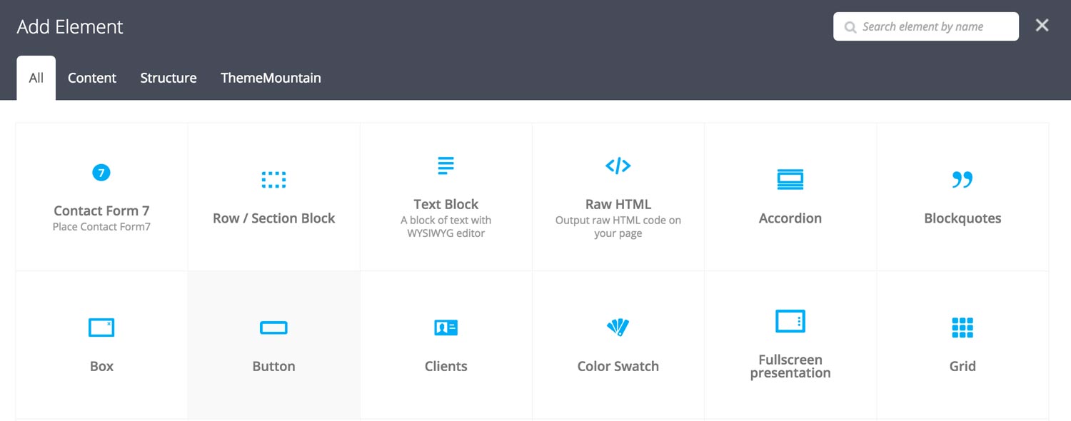
Step 2: Select Button
Click "Button" in the Visual Composer Modal to insert a box, for example:
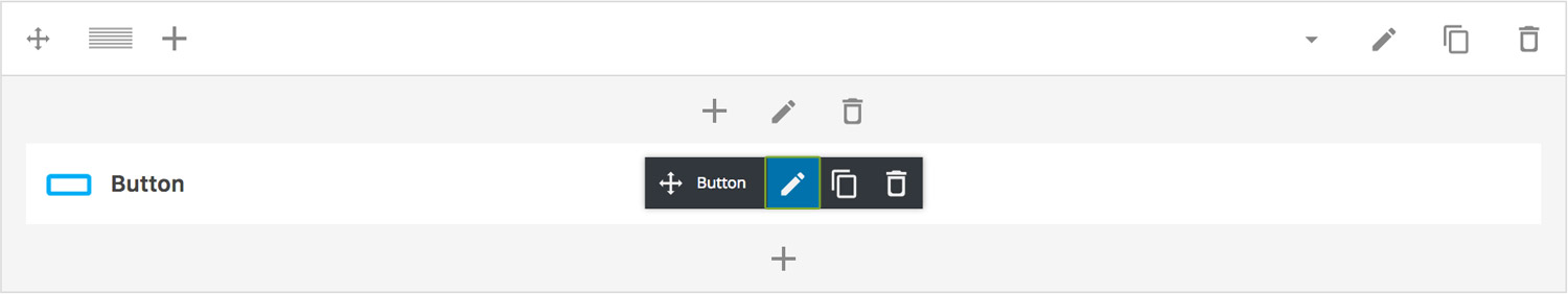
Step 3: Edit Button Settings
Once the button element has been inserted click the Edit Link(pen icon) of the button, for example:
Here is an overview of available button options:
-
Margin Bottom
Determines the bottom margin of the button. Values range from 0-150.
-
Margin Bottom on Mobiles
Determines the bottom margin of the button on mobile (from 768px and below). Values range from 0-150.
-
Link to
Determines whether the button should link to a Page, Modal or Scroll to Section. Important: If you select "Scroll to Section", you need to specify section ID (#section) in the URL field.
-
Icon
Whether the button should have an icon or not.
-
Button Label
What the button should say.
-
Modal Target
Determines which modal content the button should link to. To link to a modal, ensure to set the Link to option is set to Modal. You'll also need to create your Modal content under TM Modal.
-
URL
The page, or site, or section ID that the button should link to.
-
Target
Whether the page should open in the same window or a new one.
-
Modal Target
Determines which modal content to launch in the model. Note: In order to link to modal content you first need to create it under TM Modal custom post type. More on Modals here.
-
Scroll Offset
This option is dependent upon whether the "Scroll To Section" option is set to true. This is where you can set the scroll position offset when scrolling to a section. Accepts negative numbers.
-
Extra Class Name
If you wish to style this component differently, then use the extra class name field to add one or several class names and then refer to it in your css file.
-
Display Inline
Determines whether the button should be displayed inline. Check this option if you want to align buttons on the same line.
-
Icon Alignment
This option is dependent upon General > Icon . Determines whether button icon should be left or right aligned.
-
Button Size
Determines whether button should be small, medium, large or extra large in size.
-
Button Style
Whether button should have sharp corners, rounded corners, or be pill shaped.
-
Color Options
Background Color
Background Color hover
Border Color
Border Color Hover
Label Color
Label Color Hover
Drop Shadow
Can't find what you're looking for? Submit a request in our forum.