Logo slider
Inserting a Logo slider
A logo slider that offer four different testimonial styles, namely, simple, with border, with icon or with avatar.
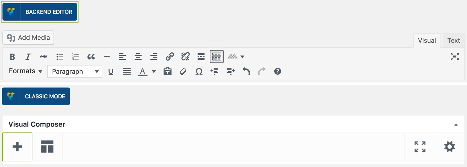
Step 1: Switch To Backend Editor
To insert a logo slider section, start by clicking the button "Backend Editor" button then click the "+"(Add Element) button, for example:
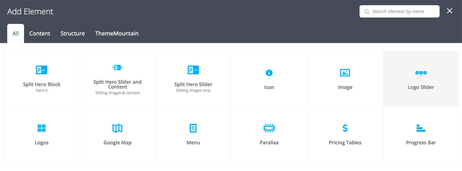
Step 2: Select Slider
Click "Logo Slider" in the Visual Composer Modal to insert a logo slider section, for example:
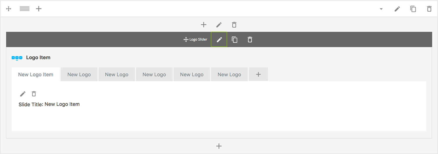
Step 3: Edit logo slider Section Settings
Once the logo slider section element has been inserted click the Edit Link(pen icon) of the logo slider section wrapper, for example:
Here is an overview of available slider section options:
-
Visible Slides
Determines the number of visible slides at any given time. Defaults to 4 slides.
-
Extra Class Name
If you wish to style this component differently, then use the extra class name field to add one or several class names and then refer to it in your css file.
-
Advance Automatically
Determines whether the slider should auto advance from slide to slide i.e. slideshow.
-
Auto Advance Interval
Determines the interval at which the slider will auto advance.
-
Pause On Hover
Determines whether auto advancing should pause upon hover.
-
Progress Bar
Determines whether the interval progress bar should be shown.
-
Use Navigation Arrows
Determines whether the slider should have navigation arrows.
-
Use Pagination
Determines whether the slider should have pagination bullets.
-
Show Navigation on Hover
Determines whether the slider navigation arrows and pagination should only appear upon mouse hover.
-
Pagination Color 1
Sets the default pagination color of the slider.
-
Slider Transition Easing
Determines the easing type of the slider transitions.
-
Slider Transition Speed
Determines the transition speed of slide transition.
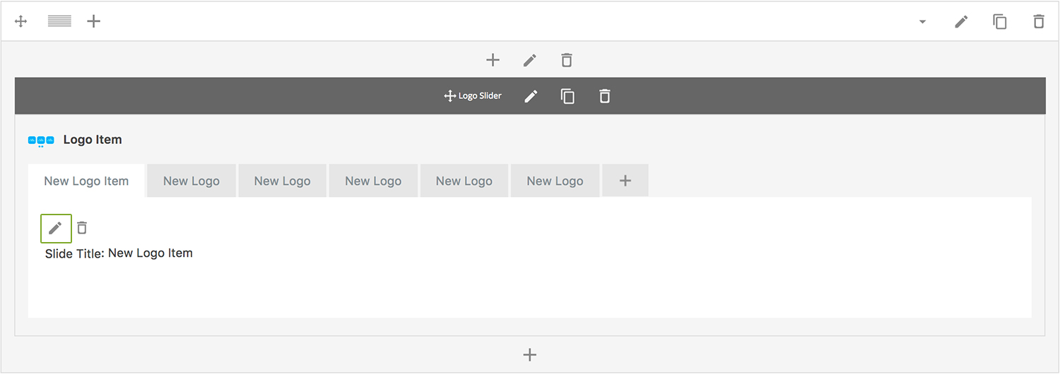
Step 4: Edit Slides
Once you have edited the slider wrapper settings, click the Edit Link(pen icon) of the slide you wish to edit, for example:
Here is an overview of available slide options:
-
Slide Title
Enter the client name.
-
Image
Choose where the image should be loaded from.
-
Uploaded Image
Upload logo image.
-
Extra Class Name
If you wish to style this component differently, then use the extra class name field to add one or several class names and then refer to it in your css file.
Can't find what you're looking for? Submit a request in our forum.