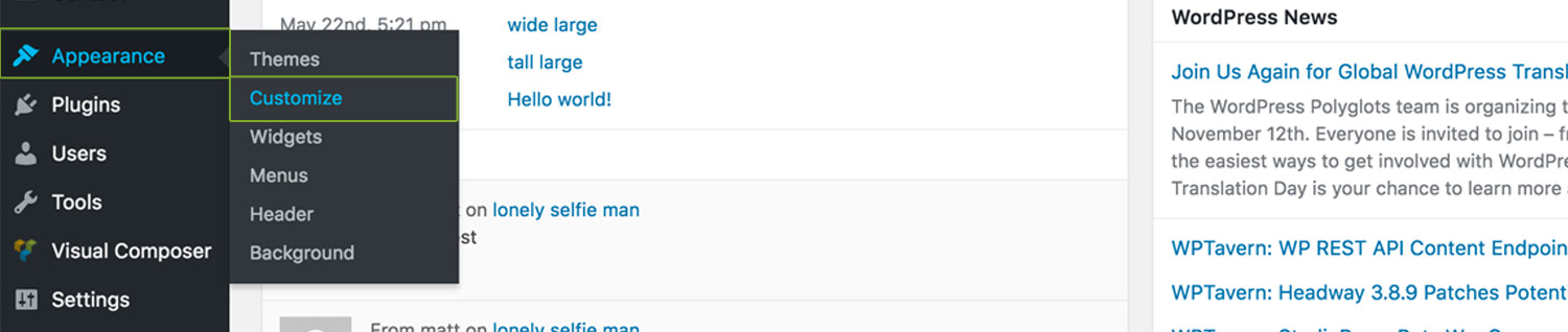
Theme Customiser
Note:Our WordPress themes employ the stadard WordPress customiser for managing global style settings as it allows changes to be visualized in real time.
To access the theme customiser, navigate to Appearance > Customiser, for example:
Customiser Settings
Header Settings
This section allows you to manage your site logo, main and mobile navigation colors, header background color states and positions.
-
Use Top Logo
Our themes allow you to use two logos for the header. Namely, a top and body header logo. The first appears by default, and the second appears as the user begins to scroll the page. This options determines whether your site should have a top logo.
-
This is where you upload your top logo. Note: the default logo width is set to 95px. This means that your logo image should measure at least 190px to ensure it looks sharp on retina displays.
-
Determines the initial width of the top logo. Note: your logo will proportionally scale in height based on its width. If you have a vertical shaped logo, consider modifying the "Top Header Height" and "Body Header Height" under "Header Settings > Hader Navigation Apperance".
-
-
Use Body Logo
Determines whether your site should use the same image that you uploaded for the top logo for the body logo, whether it should be different or whether you should use no body logo.
-
This is where you upload your body logo.
-
Determines the initial width of the body logo. Note: If the header is reduced in height upon scroll, consider reducing the logo width as well for the body logo.
-
-
Logo Hover Opacity
Determines the logo opacity upon hover.
-
Header Navigation Type
Determines whether your site should employ the default main navigation, hamburger navigation. a hybrid of the two, or hide the navigation alltogether.
-
Navigation Menu Alignment
Determines the primary navigation alignment: left, center or right.
-
Secondary Navigation Alignment
Determines the secondary navigation alignment: left, center or right.
-
Below are dependent color options for each navigation type:
-
Top Header Navigation Color
Top Header Navigation Hover Color
Top Header Navigation Current Color
Body Header Navigation Color
Body Header Navigation Hover Color
Body Header Navigation Current Color
Sub & Mega Menu Background Color
Sub & Mega Menu Link Color
Sub & Mega Menu Link Hover & Current Color
Sub & Mega Menu Link & Active Background Color
Top Header Background Color
Top Header Border Bottom Color
Body Header Background Color
-
Logo and Hamburger background color
Hamburger menu icon color
Hamburger menu icon hover color
-
-
Header Position
Determines the position of the header, either:
- Relative - header is positioned above content and scrolls with the page
- Absolute - header is positioned over content BUT scrolls with the page
- Fixed - header is positioned over content and does NOT scroll with the page.
-
Header Position Mobile
Determines whether the header should scroll with the content or remain fixed on mobile.
-
Header Vertical Alignment
Determines whether the header should be position top or bottom of the viewport.
-
Header Bottom Value
Determines the bottom position pixel value of the header.
-
Top Header Height
Determines initial header height. Note: default is set to 80px.
-
Body Header Height
Determines body header height. Note: default is set to 65px.
-
Body Header Height Threshold
Determines how many pixels the user must scroll before the header swaps height. Note: default is set to 100px.
-
Body Header Background Color Threshold
Determines how many pixels the user must scroll before the header swaps background color. Note: default is set to 100px.
Overlay Navigation Settings
This section allows you to manage the overlay navigation appearance.
-
Color Options
Overlay Navigation Color
Overlay Navigation Hover & Active Color
-
Color Options
Overlay Background Color
Overlay Exit Button Color
Overlay Exit Button Hover Color
Overlay Navigation Title Color
Overlay Navigation Copyright Color -
Overlay Navigation Appearance
Determines the animation of the overlay navigation, either scale in, slide in top, right or bottom or left.
Content Settings
In this section you can manage everything from fonts, font colors, to default titles for pages such as Tm folio, 404 pages, archive, category, search and author index pages.
-
Font Presets
Font presets are carefully selected fonts that work well together. We have created these to save you time. In this section you can select between 15 different font pairs selected by the ThemeMountain Team.
-
Manual Font Settings
In this section you can set your own font pairs and sizes for each section of the theme. Note: In this section you can also change the font family targeting for most sections of the theme. Some knowledge of CSS is required for this.
-
Show back to top button
Determines whether the "back to top" link should be shown or hidden.
-
Available Body Color Options
Content Body Text Color
Title Color
Title Link Color
Title Link Hover Color
Link Color
Link Hover Color
Lead Font Color
Blockquote Font Color
-
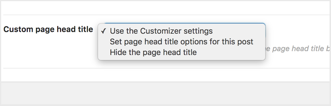
Page Header Title
Sets the page title for the blog index. Note: The page title set in the customiser will ONLY appear if "Custom page head title" for the Blog has been set to "Use Customiser Settings". For example:
-
Show Advanced Settings Items
This section controls advanced settings such as blog index layout, sidebar options and header styles.
-
Determines the blog index page layout, either Wide Layout, 3 Column Layout or 4 Column Layout.
-
Determines whether the blog index page layout should have No sidebar, Sidebar to the left or Sidebar to the right.
-
-
Use Page Head Title
Determines whether a page header title should be used. If used, the following options are available:
-
Page Head Title Background Color
Page Head Title Font Color
-
Upload a header background image.
-
-
Use Custom Settings
By default global settings are used. You can specify unique settings for the Single Posts page by turning on "Use Custom Settings". Below is an overview of custom settings:
-
Determines whether the single posts page layout should have No sidebar, Sidebar to the left or Sidebar to the right.
-
-
Use Page Head Title
Determines whether a page header title should be used. If used, the following options are available:
-
Page Head Title Background Color
Page Head Title Font Color
-
Upload a header background image.
-
-
Enable Twitter SNS icon
Whether the single post page should have a Twitter share icon
Enable Facebook SNS icon
Whether the single post page should have a Facebook share icon
Enable Google+ SNS icon
Whether the single post page should have a Google+ share icon
-
Here is an overview of options for the following page templates:
Page
Project Page
404 Not Found Page
Archive Index Page
Category Index Page
Search Index Page
Author Index Page
-
Page Header Title
Sets the page title for the page template. Note: The page title set in the customiser will ONLY appear if "Custom page head title" for the page template has been set to "Use Customiser Settings". For example:
-
Use Page Head Title
Determines whether a page header title should be used. If used, the following options are available:
-
Page Head Title Background Color
Page Head Title Font Color
-
Upload a header background image.
-
-
Color Options
Lightbox Overlay Background Color
Lightbox Navigation Color
Lightbox Caption Background Color
Lightbox Caption Color
-
Color Options
Loader Track Border Color
Loader Color -
Border Thickness
Determines the loader track and bar thickness.
-
Loader Size
Determines the loader size.
Footer Settings
In this section you can manage the number of footer columns, footer colors and footer form colors.
-
Footer Columns
Determines the number of columns the footer should have. Note: Our themes support 1-4 footer columns.
-
Column Content Alignment
Determines the content alignment of each footer column. Alignment can be set for each individual column.
-
Available Color Options
Footer Background Color
Footer Text Color
Footer Link Text Color
Footer Text Hover Color
Footer Title Color
Footer Text Font Size
-
Available Color Options
Form Background Color
Form Border Color
Form Placeholder Color
Form Focus Background Color
Form Focus Border Color
Form Focus Text Color
Form Required Background Color
Form Required Border Color
Form Required Text Color
Form Error Background Color
Form Error Border Color
Form Error Text Color
Form Submit Background Color
Form Submit Border Color
Form Submit Text Color
Form Submit Hover Background Color
Form Submit Hover Border Color
Form Submit Hover Text Color
Form Response Message Color
Form Settings
In this section you can manage all form colors relating to contact forms, comment forms, and search fields.
Available Color Options
Form Background Color
Form Border Color
Form Placeholder Color
Form Focus Background Color
Form Focus Border Color
Form Focus Text Color
Form Error Background Color
Form Error Border Color
Form Error Text Color
Form Submit Background Color
Form Submit Border Color
Form Submit Text Color
Form Submit Hover Background Color
Form Submit Hover Border Color
Form Submit Hover Text Color
Form Response Message Color
Site Identity
This section is where you can manage your site title and slogan.
Site Title
Your WordPress site title
Site Title
Your WordPress site tagline or slogan
Favicon
Upload your favicon. This icon is used as a browser and app icon for your site.
Menus
For more information on managing menus, please visit the Custom Menus section.
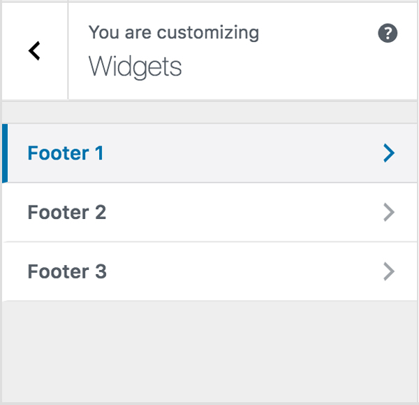
Widgets
This is where you can manage your footer widgets.
In this section you'll see an individual widget area for each column you have set under "Footer Settings > Footer Columns". So if you have opted for three footer columns, you should see three footer widget areas. For example:
Note: This live preview and management of widgets via the Customizer serves as a secondary option to the traditional widget management workflow already in place. Click here to read more about managing footer widgets the traditional way.
-
Sidebar widgets can be set under Appearance > Widgets. Click here to read more about sidebar widget areas.
Static Frontpage Settings
This section is where you can manage your front page (homepage) and post page (blog).
-
Selecting "Your latest posts" will set your post index (blog) as your homepage.
-
Front page
Select "Homepage" as your front page.
-
Posts Page
Select blog "Blog" as your posts page.
-
Note: If you have not imported the demo content that came with the theme, you'll need to the create your Homepage and Blog page by going to Page > Add New.
Additional CSS
This is where you can add your own CSS. This is particularly useful if you have given one or several shortcode elements custom classes using the extra class name field. Simply reference them here.
Can't find what you're looking for? Submit a request in our forum.