Rows & Columns
Inserting Rows & Columns
Our grid is constructed of horizontal rows that define the max-width of the page, in this case 1140px. The rows form the outer layer of the layout, while the columns, create the inner, more complex layouts.
Related Video Tutorials
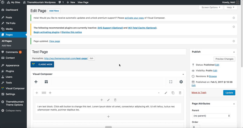
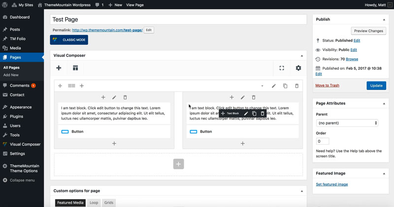
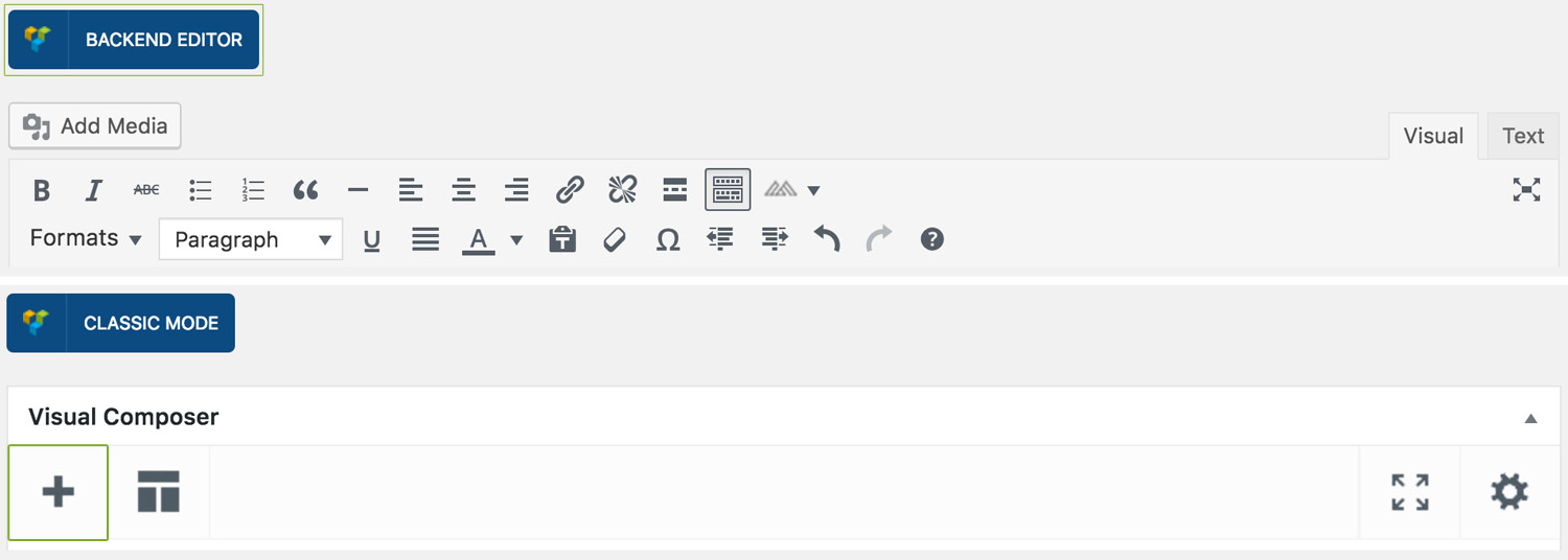
Step 1: Switch To Backend Editor
To insert a box, start by clicking the button "Backend Editor" button then click the "+"(Add Element) button, for example:
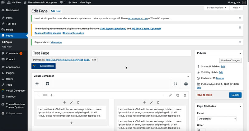
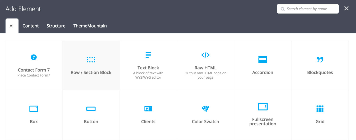
Step 2: Select Rows
Click "Row/Section" in the Visual Composer Modal, for example:
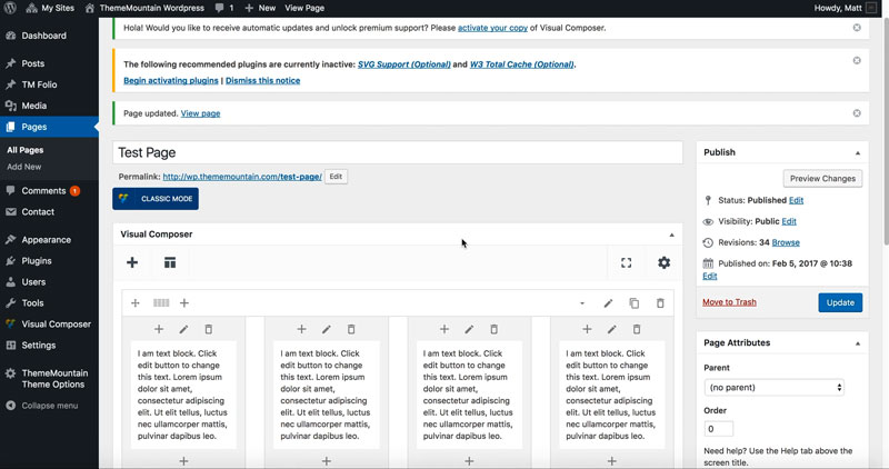
Step 3: Choose Columns
Select the number of columns and the column widths required using one of several column presets, for example:
Row / Section Block Settings
As our themes are built using blocks, our rows come with a few key features to make designing and spacing easier. Here is a breakdown of the available row options:
Section Block
If this option is checked, the row is wrapped in a section block which receives top and bottom padding. This becomes useful when creating new page sections. Default top/bottom padding is set to 110px and can be modified under "Spacing & Size".
Here is a representation of what converting the row to a section block does (padding represented by green areas):
Equalize
When designing layouts it might come in handy to equalize columns. If this option is checked, it means that no matter the content in each column, the columns will all become the same height as the tallest column. Here is a representation of this:
Column Content 1
Column Content 2
This is the tallest column. The two other columns will stretch in height to match the height of this one.
Column Content 3
Extra Class Name
If you wish to style this component differently, then use the extra class name field to add one or several class names and then refer to it in your css file.
-
Padding Top
Sets the top padding of a section block. Default is set to 110px. Possible values range from 0-150px.
-
Padding Bottom
Sets the bottom padding of a section block. Default is set to 110px. Possible values range from 0-150px.
-
Background Color or Image
If this option is checked, options for setting background color or adding image will appear.
-
Background Color
Sets the background color of the row or section block.
-
Background Image
Sets the background image of the row or section block.
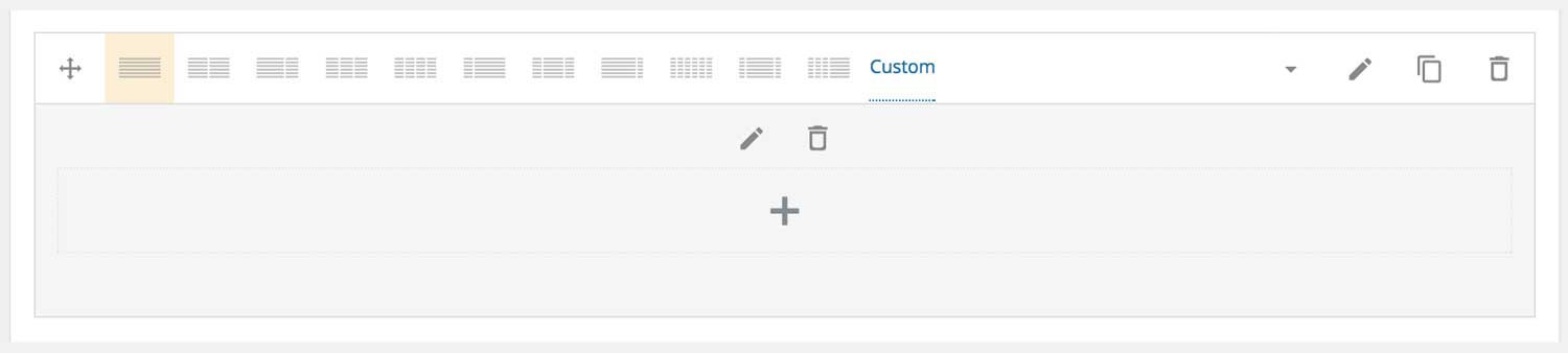
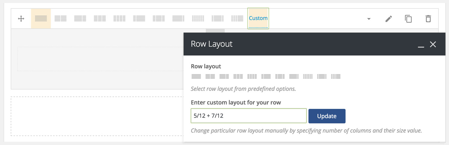
Custom Column Widths
You can also enter custom column widths by clicking on "Custom" and then entering the column widths in the designated textfield. Note: If creating multiple columns, remember to add the column width follow by a plus sign, for example.
Here is an overview of the possible combinations that our Timber Row/Column system offers:
Column Settings
-
Horizontal Content Alignment
Determines whether the column content should be left, center or right aligned on desktop.
-
Horizontal Content Alignment Mobile
Determines whether the column content should be left, center or right aligned on mobile (below 768px).
-
Vertical Content Alignment
Determines whether the column content should be top, middle or bottom aligned within the column. Option only works if the Equalize settings is checked for the parent row.
-
Extra Class Name
If you wish to style this component differently, then use the extra class name field to add one or several class names and then refer to it in your css file.
-
Animation Type
Determines the type of animation that will be applied to the column.
-
Animation Duration
How long the animation should be. Expressed in milliseconds i.e. 1000 represents 1 second.
-
Animation Delay
How long before the animation should begin upon entering the viewport. Expressed in milliseconds i.e. 100 represents 0.1 second.
-
Animation Threshold
Represents what percentage of the element should be visible in the viewport before animation begins. Expressed as a decimal i.e. i.e. 0.5 represents 50%.
-
Background Color or Image
If this option is checked, options for setting background color or adding image will appear.
-
Background Color
Sets the background color of the row or section block.
-
Background Image
Sets the background image of the row or section block.
-
Column Styling
Wraps a column in a box with hard or rounded corners.
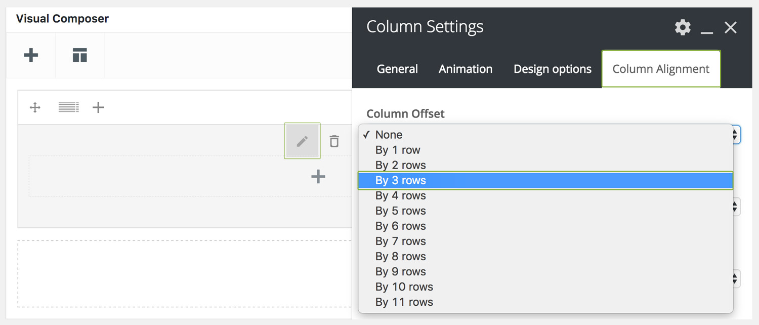
Understanding Column Offset
At times it can be useful to offset(move) a column x number of columns without having to insert multiple columns. This can easily be done by using the Column Offset options under Edit Column > Column Alignment(tab) > Column Offset, for example:
Here are some examples of commonly used offsets in our themes to center align columns:
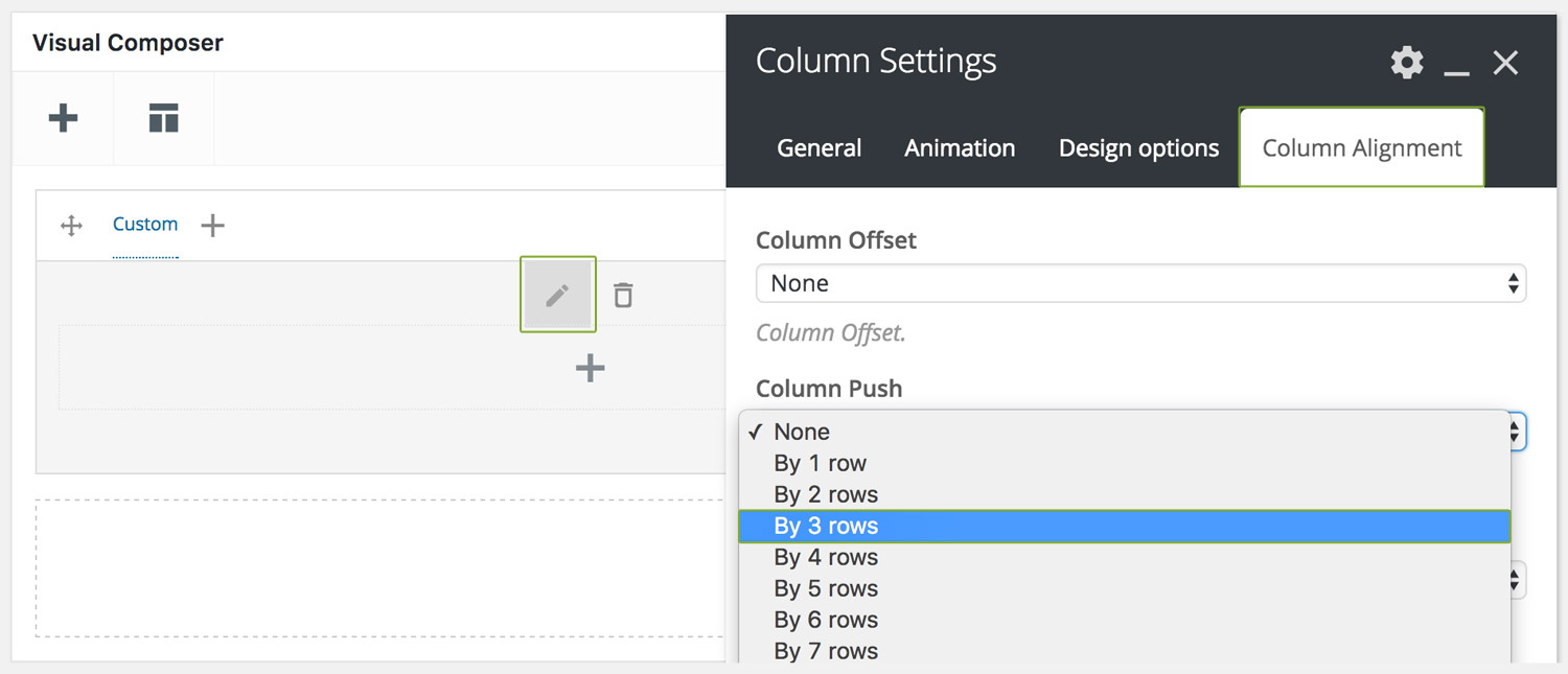
Understanding Column Push/Pull
At times you may want to show content differently on desktop than you do on mobile. For example, on desktop you may want to show some icons to the left of the main content, but on mobile you'd want the very same icons to appear below the content. This by default is not possible using columns, but by using the special push/pull options we can achieve this. Here is a working example to illustrate this point:
Push or pull a column by going to Edit Column > Column Alignment(tab) > Column Push | Pull, for example:
Can't find what you're looking for? Submit a request in our forum.