In-editor Shortcodes
Shortcodes Accessible from the TinyMce Editor
Places where Visual Composer shortcodes cannot be iserted, the tinyMCE shortcodes can be used instead. This generally relates to text areas. Shortcodes that can be accessed directly from the tinyMCE(texteditor) include:
- Divider
- Progress Bar
- Stat
- Button
- Blockquote
- Social Share
- Icon Link
- Subscribe Form
Related Video Tutorials
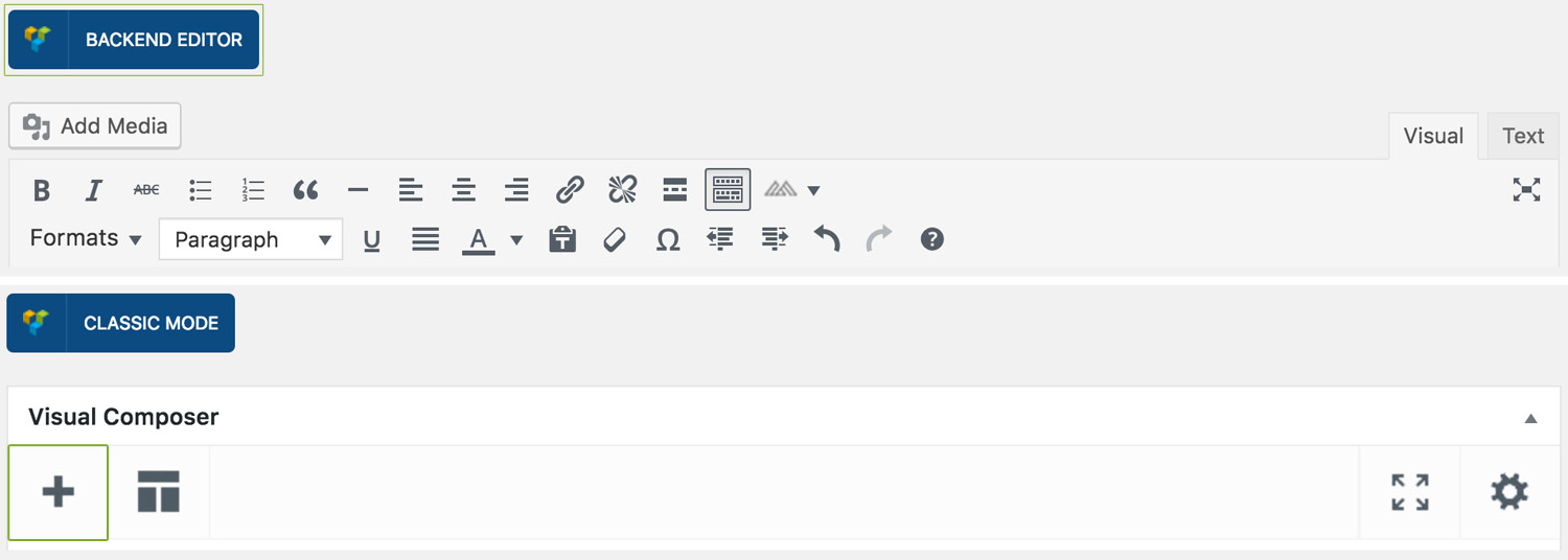
Step 1: Switch To Backend Editor
To insert a box, start by clicking the button "Backend Editor" button then click the "+"(Add Element) button, for example:
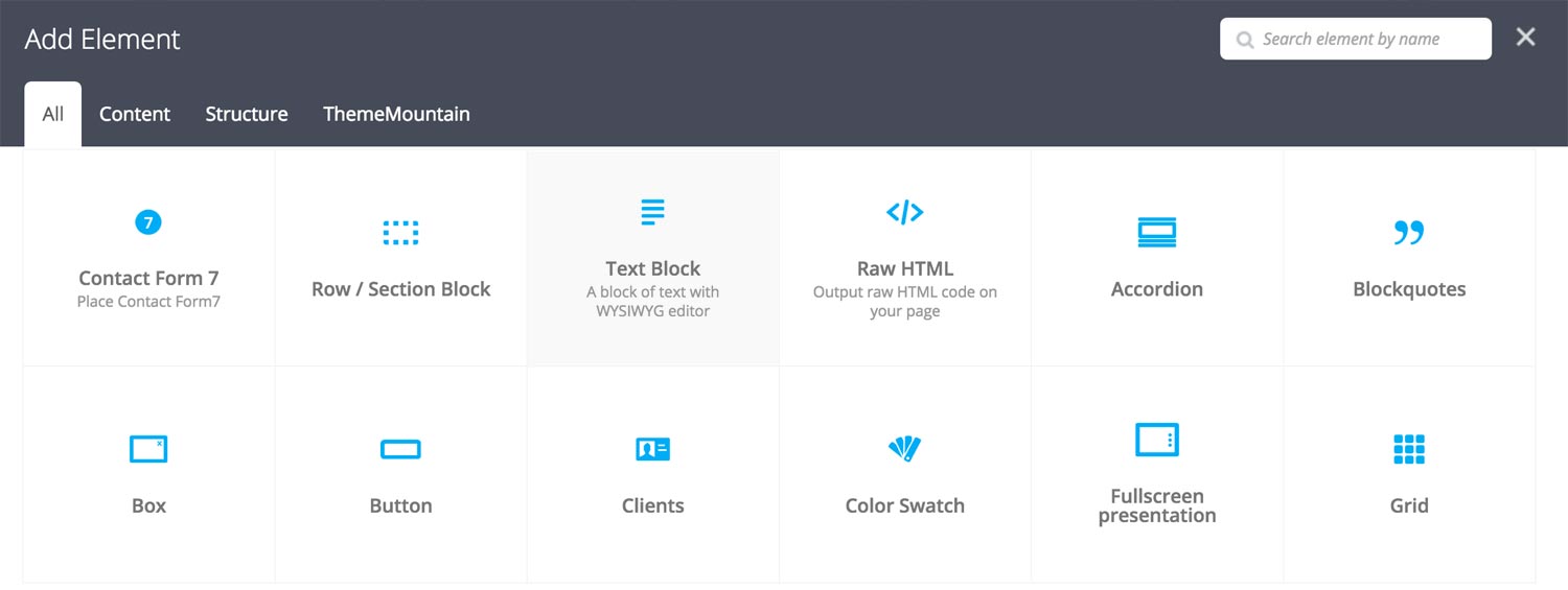
Step 2: Select Text Block
Click "Text Block" in the Visual Composer Modal to a text block, for example:
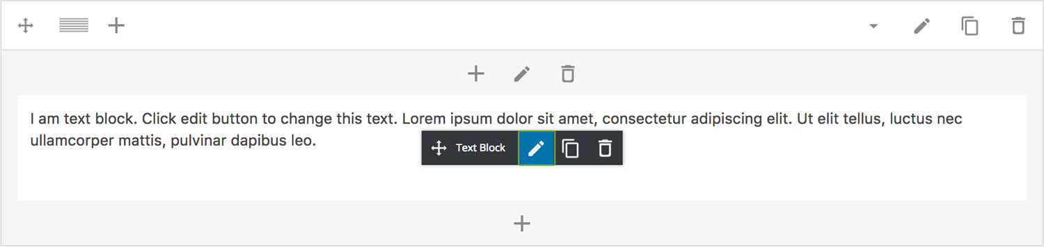
Step 3: Edit Tab Settings
Once the text block element has been inserted click the Edit Link(pen icon) of the text block, for example:
Step 4: Select Your Shortcode
Once the tinyMCE editor opens, locate the ThemeMountain logo in the left hand corner, click it and select your shortcode, for example:
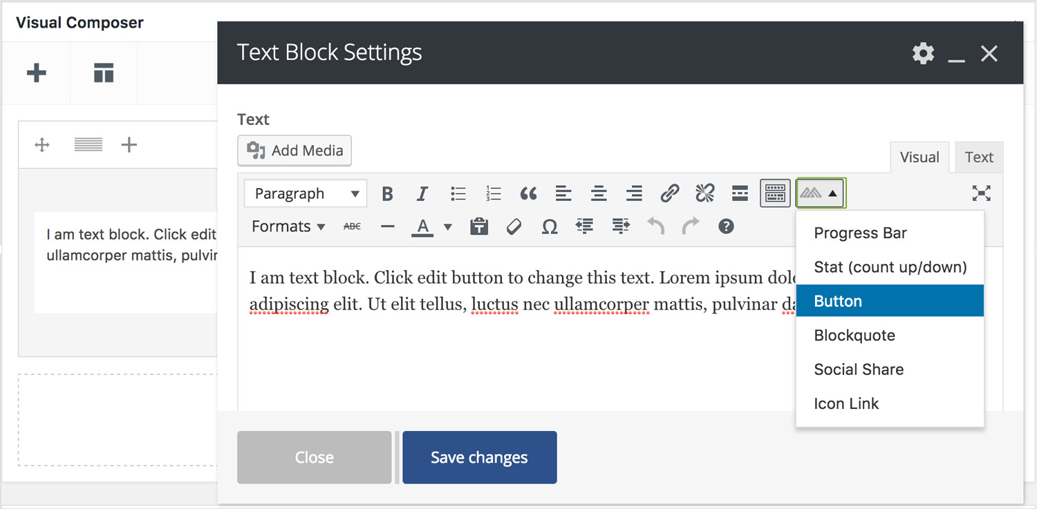
Here is an overview of available shortcodes and their options:
-
Show
Deteremines the visiblity of the divider on dektop and mobile.
-
Boder Style
Deteremines the border style of the divder, either solid, dotted or dashed.
-
Boder Thickness
Determines the border thickness.
-
Boder Color
Determines the border color.
-
Boder Thickness
Determines the border thickness.
-
ID
Gives the bar an ID.
-
Extra Class
Gives the bar a class.
-
Label
Sets the bar label.
-
Percentage
Determines the bar width in percentage. Entered as an integer 0-100.
-
Hide Measure
Hides the bar measure.
-
Animate the bar
Determines whether the bar should be animated or not.
-
Size
Determines the bar size, either small, medium, large or extra large.
-
Border Style
Determiens whether the bar should have sharp corners, rounded corners or pilled shaped.
-
Track Background Color
Sets the track background color. Entered as a hex value.
-
Track Border Color
Sets the track border color. Entered as a hex value.
-
Bar Background Color
Sets the bar background color. Entered as a hex value.
-
Text Color
Sets the label and percentage color. Entered as a hex value.
-
ID
Gives the bar an ID.
-
Extra Class
Gives the bar a class.
-
Stat from
Sets the starting number of the stat.
-
Stat to
Sets the ending number of the stat.
-
Description
Adds a description to the stat.
-
Font Size
Sets the font size of the stat.
-
Stat Color
Sets the stat text color. Entered as a hex value.
-
Description Font Size
Sets the font size of the description.
-
Description Color
Sets description text color. Entered as a hex value.
-
ID
Gives the bar an ID.
-
Extra Class
Gives the bar a class.
-
Margin Bottom
Sets the bottom margin of the button.
-
Margin Bottom Mobile
Sets the bottom margin of the button on mobile and 768px and below.
-
Display Inline
Determines whether the button should be displayed inline. Note: check this option if you'd want align the button center or right.
-
Link To
Determines what the button should link to, to page, to a modal or whether it should scroll to a section.
-
Scroll Offset
Sets the scroll offset of the button.
-
Button Label
Sets the button label.
-
Button Sub Label
Sets the button sub label. Only shown if the Button Type is set to App Button
-
URL
If linking to a page or section, enter the page URL or section ID here.
-
Target
Determines whether the page should open in the same or new tab.
-
Modal ID
Enter the ID of the modal you want to link to.
-
Size
Sets the stat text color. Entered as a hex value.
-
Style
Sets the font size of the description.
-
Background Color
Sets button background color. Entered as a hex value.
-
Background Hover Color
Sets button background hover color. Entered as a hex value.
-
Border Hover Color
Sets button border color. Entered as a hex value.
-
Label Color
Sets button border label color. Entered as a hex value.
-
Label Hover Color
Sets button border label hover color. Entered as a hex value.
-
Drop Shadow
Adds shaodw to the button.
-
ID
Gives the bar an ID.
-
Extra Class
Gives the bar a class.
-
Quotation
Enter the quote here.
-
Cite
Enter the person being cited here. Leave blank not to show.
-
Description
Adds a description to the stat.
-
Type
Determines the blockquote type, either no style, with icon, with border or with avatar.
-
Avatar Image URL
Enter avatar URL here. Note that the avatar image will only show if blockquote type has been set to "with avatar".
-
Size
Sets the size of the blockquote to either, small, medium, large or extra large.
-
Alignment
Sets the text alignment of blockquote to either, left, center or right.
-
Float
Sets the float of the blockquote to either, none, left or right.
-
Icon Class
Enter the icon class to be used. Defaults to "icon-quote". Note that the icon is only show if blockquote type ahs been set to "with icon".
-
Icon Color
Sets the icon color. Entered as hex value.
-
Border Color
Sets the border color of the blockquote. Entered as hex value.
-
Quote Color
Sets the color of the blockquote. Entered as hex value.
-
Cite Color
Sets the cite color. Entered as hex value.
-
ID
Gives the bar an ID.
-
Extra Class
Gives the bar a class.
-
Facebook
Adds Facebook share link.
-
Twitter
Adds Twitter share link.
-
Pinterest
Adds Pinterest share link.
-
Google Plus
Adds Google Plus share link.
-
Alignment
Determines whether the social share links shold be left, center or right aligned.
-
Size
Sets the size of the icons to either, small, medium, large or extra large.
-
Icon Color
Sets icon color. Entered as a hex value.
-
Icon Hover Color
Sets icon hover color. Entered as a hex value.
-
ID
Gives the bar an ID.
-
Extra Class
Gives the bar a class.
-
Link URL
The page that the icon shold link to.
-
Icon
Enter the name of the icon you wish to use.
-
Target
Determines whether the page shold open in the same or in a new tab.
-
Size
Sets the size of the icon to either, small, medium, large or extra large.
-
Icon Color
Sets icon color. Entered as a hex value.
-
Icon Hover Color
Sets icon hover color. Entered as a hex value.
-
ID
Gives the icon an ID.
-
Extra Class
Gives the icon a class.
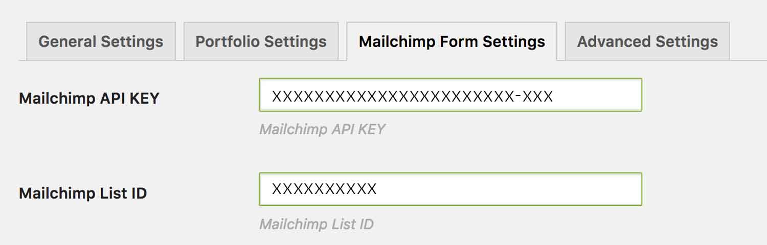
Note: Before adding the subscribe form to your site, make sure that you have entered your MailChimp API Key and List ID in the options panel ThemeMountain Theme Options Panel > MailChimp Form Settings.
-
Hide Name Field
Determines whether the name field should be shown or hidden.
-
Hide Last Name Field
Determines whether the last name field should be shown or hidden.
-
Format
Determines the how the form should be display, either horizontal, horizontal merged, or stacked (top to bottom).
-
Form Size
Determines the form elements size, either small, medium, large or extra large.
-
Form Corner Style
Determines the corner style of the form elements, either none, rounded or pill shaped.
-
Button Background Color
Sets button background color. Entered as a hex value.
-
Button Background Hover Color
Sets button background hover color. Entered as a hex value.
-
Button Border Color
Sets button border color. Entered as a hex value.
-
Button Border Hover Color
Sets button border hover color. Entered as a hex value.
-
Button Label Color
Sets button text color. Entered as a hex value.
-
Button Label Hover Color
Sets button hover text color. Entered as a hex value.
-
Form Background Color
Sets input background color. Entered as a hex value.
-
Form Border Color
Sets input border color. Entered as a hex value.
-
Form Placeholder Color
Sets input placeholder (initial text) color. Entered as a hex value.
-
Form Focus Background Color
Sets input focus background color. Entered as a hex value.
-
Form Focus Border Color
Sets input focus border color. Entered as a hex value.
-
Form Focus Text Color
Sets input focus text color. Entered as a hex value.
-
Form Error Background Color
Sets input error background color. Entered as a hex value.
-
Form Error Border Color
Sets input error border color. Entered as a hex value.
-
Form Error Text Color
Sets input error text color. Entered as a hex value.
-
Response Message Text Color
Sets response message text color. Entered as a hex value.
-
Hide Initial Response Message
Determines whether an initial form message be shown or hidden.
-
Initial Response Message
If entered an initial form message will appear i.e. "We don't spam, promise!". Entered as a hex value.
-
ID
Gives the icon an ID.
-
Extra Class
Gives the icon a class.
Can't find what you're looking for? Submit a request in our forum.