Tabs
Inserting Tabs
Much like accordions, tabs are a great way for presenting information in a limited amount of space.
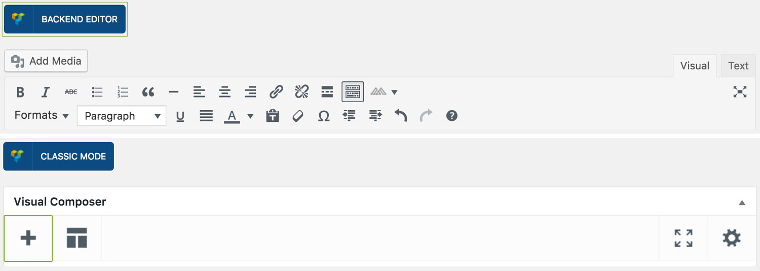
Step 1: Switch To Backend Editor
To insert tabs, start by clicking the button "Backend Editor" button then click the "+"(Add Element) button, for example:
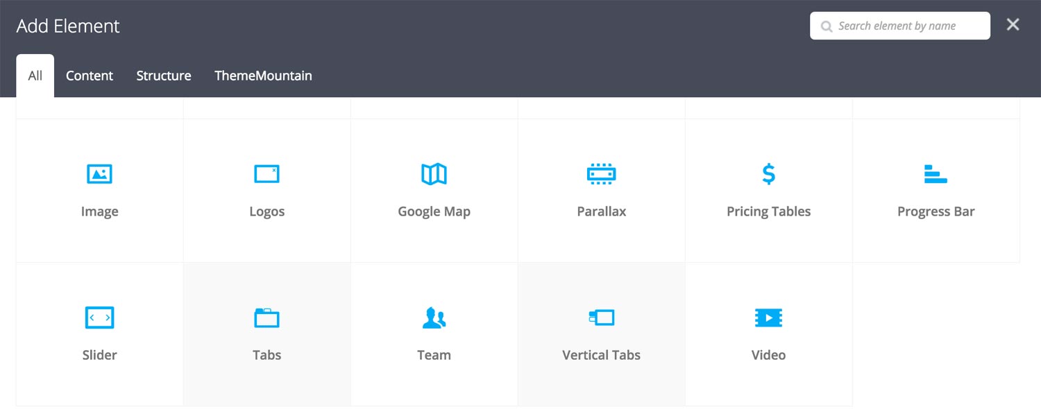
Step 2: Select Tabs (Horizontal or Vertical)
Our tabs can be displayed horizontally or vertically. Click "Tabs" in the Visual Composer Modal to insert horizontal tabs, click "Vertical Tabs" to insert vertical tabs, for example:
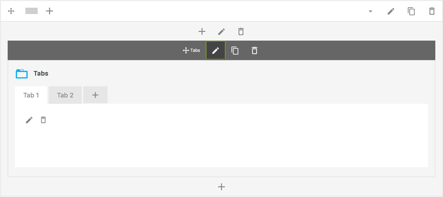
Step 3: Edit Tab Settings
Once the tab element has been inserted click the Edit Link(pen icon) of the tab wrapper, for example:
Here is an overview of available tabs options:
-
Alignment
Whether the tabs should be left, center (horizontal tabs only) or right aligned.
-
Extra Class Name
If you wish to style this component differently, then use the extra class name field to add one or several class names and then refer to it in your css file.
-
Tab Style
Sets the accordion style to either Default, Button, Line or Text.
-
Tab Size
Determines whether tabs should be small, medium, large or extra large in size.
-
Tab Border Style
Choose whether the tabs should have sharp or rounded corners.
-
Color Options
Button Background Color
Button Background Color Hover
Button Background Color Active
Button Border Color
Button Border Color Hover
Button Border Color Active
Button Text Color
Button Text Color Hover
Button Text Color Active
Tab Panel Text Color
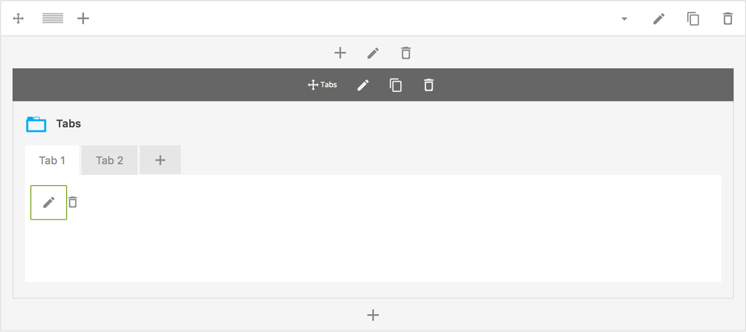
Step 4: Add Content
Once you have edited the tabs settings, click the Edit Link(pen icon) of the tabs panel you wish to edit, for example:
Here is an overview of available panel content options:
-
Tab Title
Sets the tabs tab title
-
Make this active
Determines whether the tabs panel is active by default i.e. whether it will be upon page load.
-
Content
Tab panel content, text and images are supported.
Can't find what you're looking for? Submit a request in our forum.