Slider Section
Inserting a Slider Section
Our themes offers simple full width slider section.
Related Video Tutorials
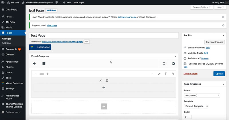
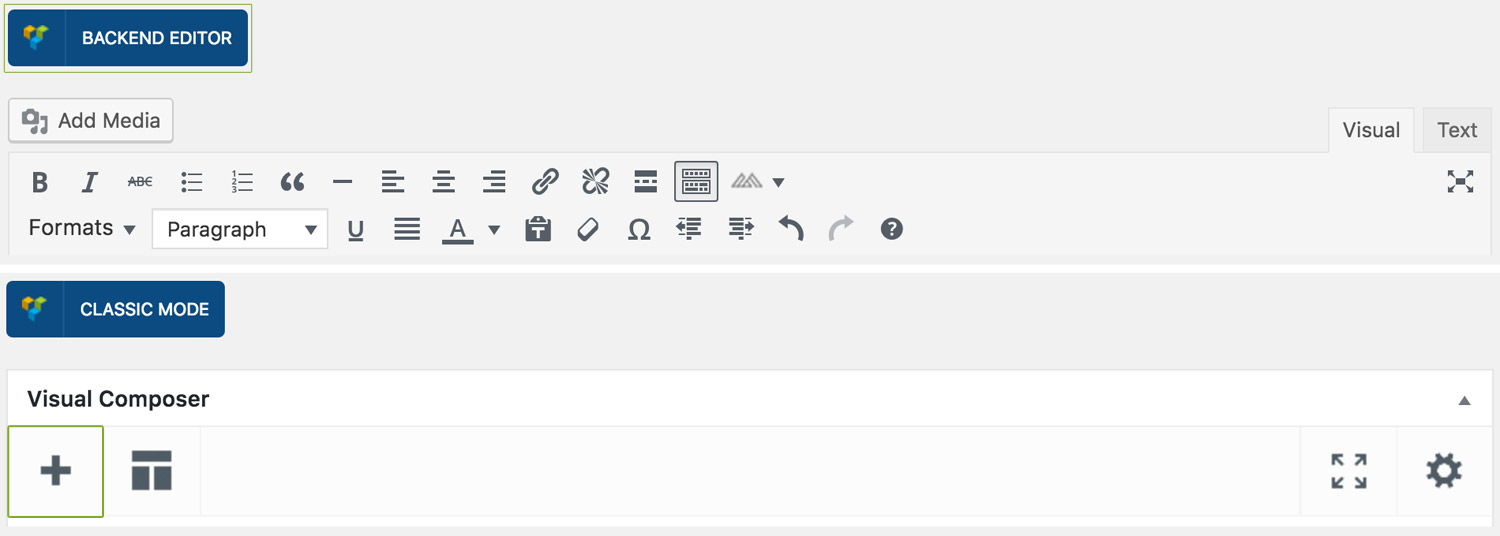
Step 1: Switch To Backend Editor
To insert a slider section, start by clicking the button "Backend Editor" button then click the "+"(Add Element) button, for example:
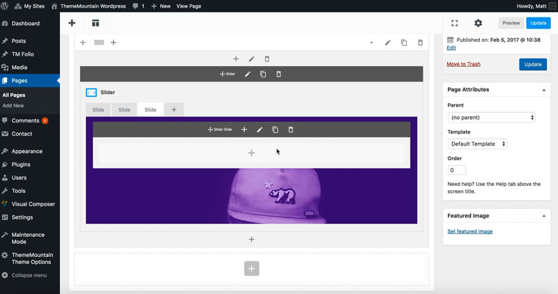
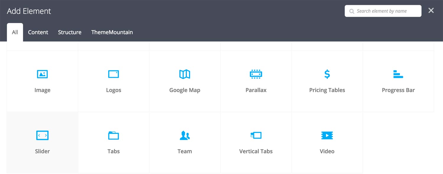
Step 2: Select Slider
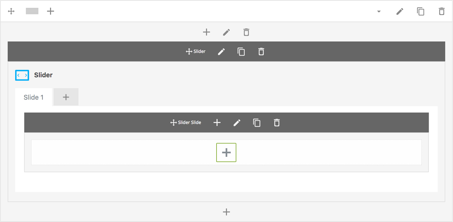
Click "Slider" in the Visual Composer Modal to insert a slider section, for example:
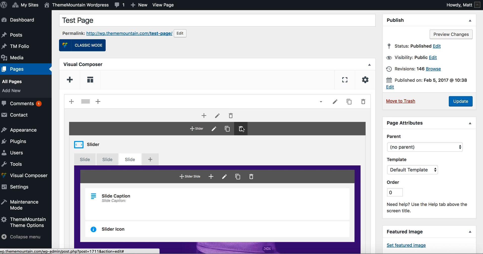
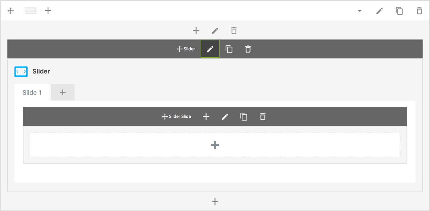
Step 3: Edit Slider Section Settings
Once the slider section element has been inserted click the Edit Link(pen icon) of the slider section wrapper, for example:
Here is an overview of available slider section options:
-
Slider Type
Determines the slider type to be used, either Content, Full Width or Fullscreen slider:
-
Width
Determines the width of the slider. Defaults to 1140px for the Content Slider and to 100% for the Full Width and Fullscreen Slider.
-
Height
Determines the starting height of the slider. Possible values include: Regular(500px), Window Height, or Custom Height.
-
Minimum Height
Determines the height beyond which the slider will not scale.
-
Scale Under
Determines at what screen width the slider should start scaling down in size.
-
Extra Class Name
If you wish to style this component differently, then use the extra class name field to add one or several class names and then refer to it in your css file.
-
ID
Give this section a unique ID. This is useful if you want to initiate scroll or link to this section.
-
Advance Automatically
Determines whether the slider should auto advance from slide to slide i.e. slideshow.
-
Auto Advance Interval
Determines the interval at which the slider will auto advance.
-
Pause On Hover
Determines whether auto advancing should pause upon hover.
-
Progress Bar
Determines whether the interval progress bar should be shown.
-
Navigation Arrows
Determines whether the slider should have navigation arrows.
-
Pagination UI
Determines whether the slider should have pagination bullets.
-
Video Auto Play
Determines whether the video should autoplay once the slide becomes active.
-
Video Replay On End
Determines video should replay on ending (loop).
-
Mute Background Video Sound
Determines whether video should be musted.
-
Pagination Color 1
Sets the default pagination color of the slider.
-
Pagination Color 2
Sets an alternative pagination color of the slider. This is useful when you need a darker or lighter pagination for a particular slide.
-
Slider Transition Easing
Determines the easing type of the slider transitions.
-
Slider Transition Speed
Determines the transition speed of slide transition.
-
Parallax
Determines whether the slider should parallax upon scrolling. IMPORTANT: Parallax will only function if the slider is the first element in the page content. If parallax sections are required, use the Parallax section.
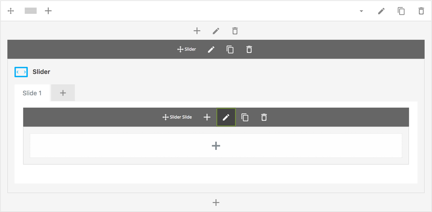
Step 4: Edit Slides
Once you have edited the slider wrapper settings, click the Edit Link(pen icon) of the slide you wish to edit, for example:
Here is an overview of available slide options:
-
Slide Title
Sets the title of the slide.
-
Forcefit
Determines whether the slider media should be scaled to its parent container.
-
Slide Type
Upload slide image.
-
Image
Upload slider image. IMPORTANT: This is required irregardless of the slide type you set. The slider image is used as a poster image for video slides.
-
Vimeo Video URL
This is where you enter the Vimeo video ID, which generally look something like this:
https://vimeo.com/46697798.Note: Vimeo URL parameters are supported. Click here to view available Vimeo Player parameters.
-
YouTube Video URL
This is where you enter the YouTube video ID, which generally look something like this: https://www.youtube.com/watch?v=bPg4tk7VFR0.
Note: YouTube URL parameters are supported. Click here to view available YouTube Player parameters.
-
MP4 URL
Enter the uploaded .mp4 video URL here.
-
WEBM URL
Enter the uploaded .webm video URL here.
-
-
Extra Class Name
If you wish to style this component differently, then use the extra class name field to add one or several class names and then refer to it in your css file.
-
Slide Background Color
Determines the slider background color.
-
Slide Overlay Color
Determines the slider overlay background color.
-
Pagination Color
Determines which pagination color to use.
-
Animation
Determines slide animation type, either Fade, Slide Left to Right, Slide Top to Bottom, Scale In or Scale Out.
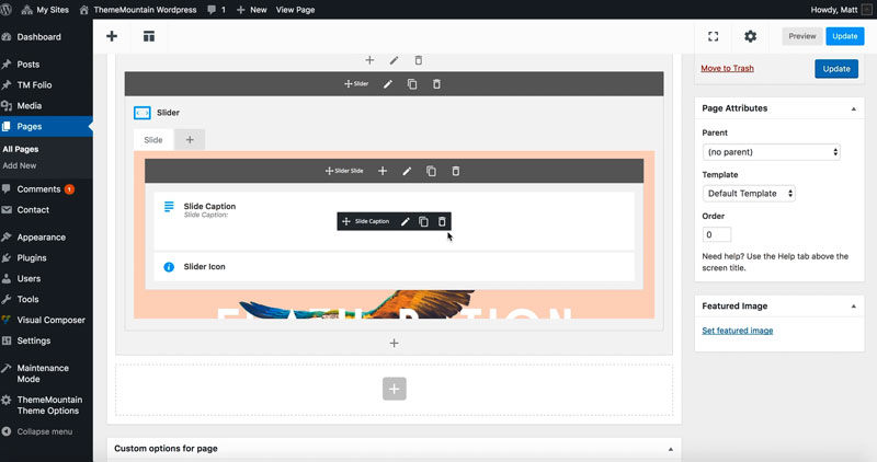
Step 5: Add/Edit Slider Captions & Buttons
Once you have edited the slide settings, click the + of the slide to which you want to add a caption and/or button to, for example:
Here is an overview of available caption options:
-
Slide Caption
The slide caption goes here.
-
Display Inline
Determines whether the caption should be inserted on its own line or aligned next to the previous caption.
-
Caption Animation Type
Determines the type of animation that will be applied to the caption.
-
Caption Animation Duration
How long the animation should be. Expressed in milliseconds i.e. 1000 represents 1 second.
-
Caption Animation Delay
How long before the animation should begin upon entering the viewport. Expressed in milliseconds i.e. 100 represents 0.1 second.
Here is an overview of available slider button options:
-
Scroll To section
Whether button should initiate a scroll to section event. Important: If this option is checked, you need to specify the section ID (#section) in the URL field.
-
Icon
Whether the button should have an icon or not.
-
Button Label
What the button should say.
-
URL
The page, or site, or section ID that the button should link to.
-
Scroll Offset
This option is dependent upon whether the "Scroll To Section" option is set to true. This is where you can set the scroll position offset when scrolling to a section. Accepts negative numbers.
-
Extra Class Name
If you wish to style this component differently, then use the extra class name field to add one or several class names and then refer to it in your css file.
-
Icon Alignment
This option is dependent upon General > Icon . Determines whether button icon should be left or right aligned.
-
Button Size
Determines whether button should be small, medium, large or extra large in size.
-
Button Style
Whether button should have sharp corners, rounded corners, or be pill shaped.
-
Color Options
Background Color
Background Color hover
Border color
Border color hover
Label Color
Label Color Hover
Drop Shadow
Can't find what you're looking for? Submit a request in our forum.