Grids
Inserting a Grid
Our grids can be displayed in one, two, three, four, five or six columns and can can be displayed as regular or masonry grids, with no, small or large gutters. Animation and resize duration can also be set.
Related Video Tutorials

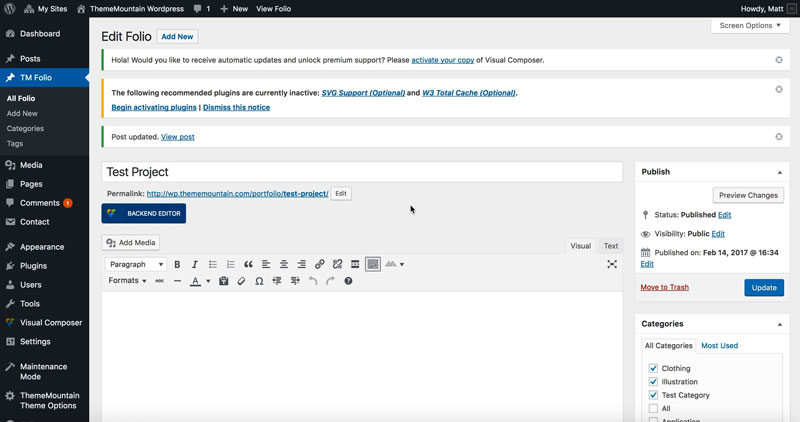
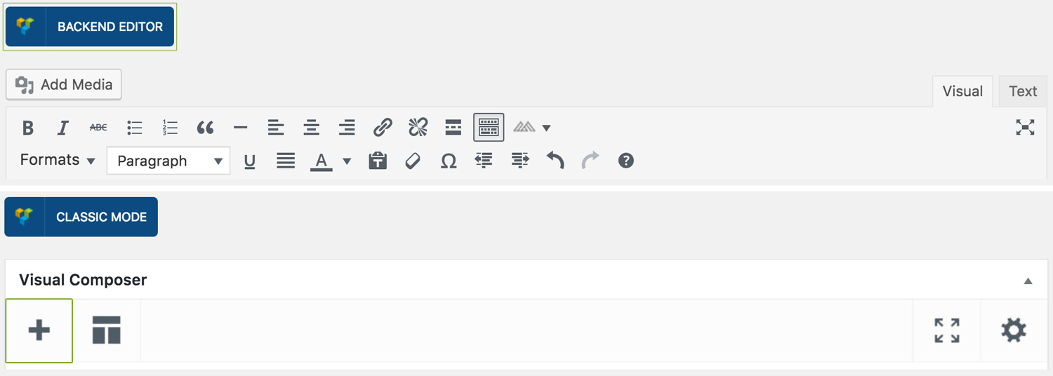
Step 1: Switch To Backend Editor
To insert a grid, start by clicking the button "Backend Editor" button then click the "+"(Add Element) button, for example:
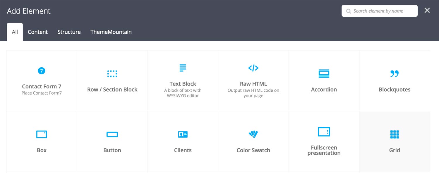
Step 2: Select Grid
Click "Grid" in the Visual Composer Modal to insert a grid, for example:
Step 3: Edit Grid Settings
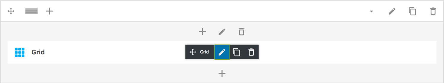
Once the grid element has been inserted click the Edit Link(pen icon) of the button, for example:
Here is an overview of available slide options:
-
Filter Menu
Determines whether the grid should have an accompanying filter menu.
-
Grid Items
This is where you associate posts and projects with a grid.
-
Determines which post type to associate with the grid. Note: For projects select "tm_folio".
-
Determines the number of grid items to show in the grid.
-
Determines whether the grid items should be order by: date, id, author, title, modified, random, comment count or menu order.
-
Determines whether the order should be ascending or descending.
-
Important: Use this field if you have selected to show only blog posts in the grid. Enter the names of the blog post categories here. The post categories will be shown in the filter menu..
TIP: Instead of listing every category you want to associate with the grid, give one common cateogry to all posts which should appear in grid i.e. news.
-
Important: Use this field if you have selected to show only projects(tm_folio) in the grid. Enter the names of the tm_ folio categories here. The project categories will be shown in the filter menu..
TIP: Instead of listing every category you want to associate with the grid, give one common cateogry to all projects which should appear in grid i.e. portfolio-1.
-
-
Width
Determines whether the grid should span full content width or full browser width.
-
Layout Mode
Determines the layout mode, either Fit Rows or Masonry.
-
Fixed Dimensions
Determines whether the grid items should receive a calculated with/height. IMPORTANT: This is necessary if you want to use a masonry grid with different sized tiles and rollovers.
-
Thumbnail Ratio
The ratio used for calculating grid item with and height. Changing the ratio will change the height of the masonry grid items.
-
Columns
Determines the number of columns that grid should have, either 2, 3, 4, 5 or 6 columns.
-
Gutters
Determines the gutter size of the grid, either no gutters, small gutters or larger gutters.
-
Extra Class Name
If you wish to style this component differently, then use the extra class name field to add one or several class names and then refer to it in your css file.
-
Grid Menu Alignment
Determines the filter menu alignment either left, center or right aligned.
-
Color Options
Link Color
Link Hover Color
Link Active Color
-
Caption Vertical Alignment
Whether caption should be vertically aligned top, middle or bottom. This only takes effect if you are using an overlayed or rollover caption.
-
Caption Horizontal Alignment
Whether the caption should be left, center or right aligned. This takes effect for all caption types.
-
Color Options
Rollover Background Color
Caption Text Color
-
Filter Duration
Determines how long the filter animation should be. Expressed in milliseconds i.e. 1000 represents 1 second.
-
Resize Duration
Determines how long the resize animation should be. Expressed in milliseconds i.e. 1000 represents 1 second.
-
Rollover Animation Type
Determines the rollover animation style.
-
Rollover Animation Duration
Determines how long the rollover animation should be. Expressed in milliseconds i.e. 1000 represents 1 second.
-
Rollover Easing Type
Determines the rollover animation easing type.
Can't find what you're looking for? Submit a request in our forum.