Split Hero Slider with Sliding Images
Inserting a Split Hero Slider Section
A split hero slider with sliding images and static content.
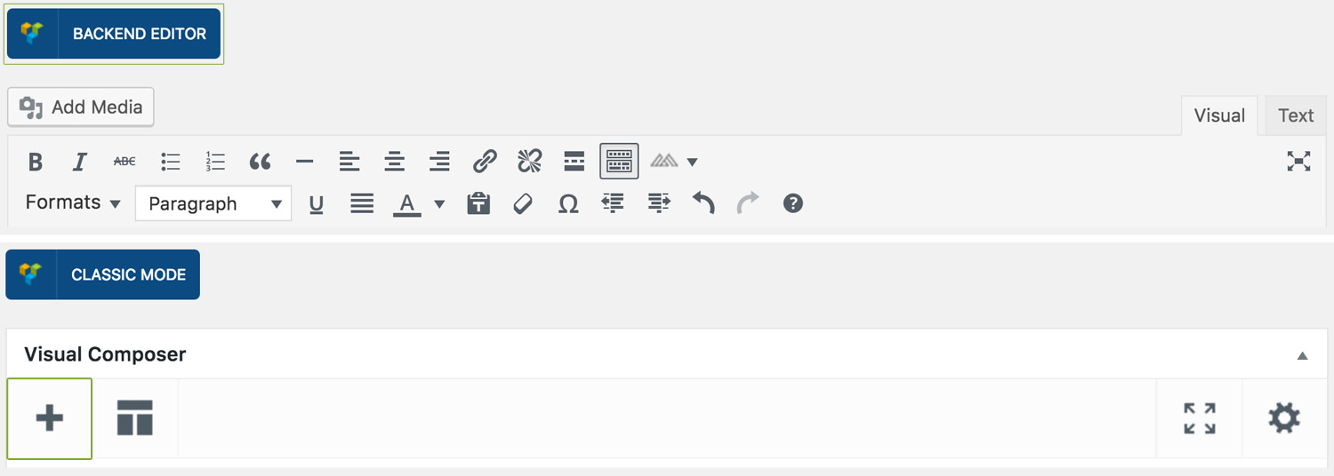
Step 1: Switch To Backend Editor
To insert a split hero slider section, start by clicking the button "Backend Editor" button then click the "+"(Add Element) button, for example:
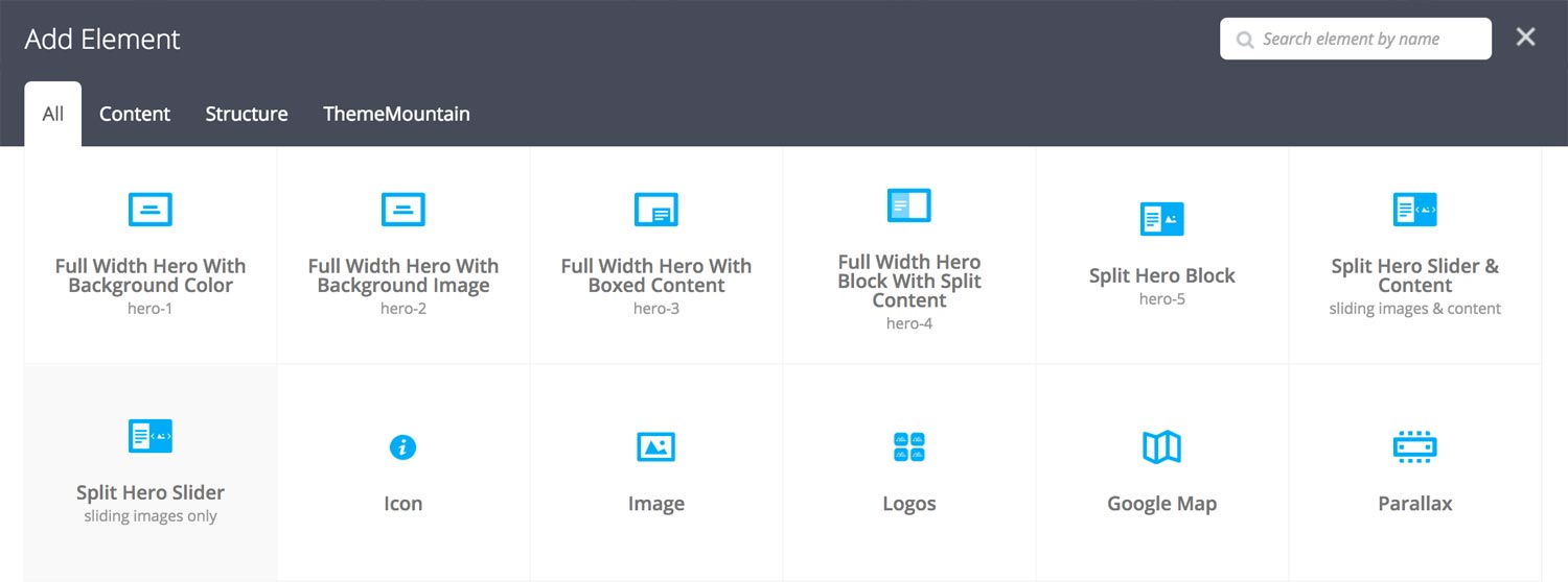
Step 2: Select Slider
Click "Split Hero Slider" in the Visual Composer Modal to insert a split hero slider section, for example:
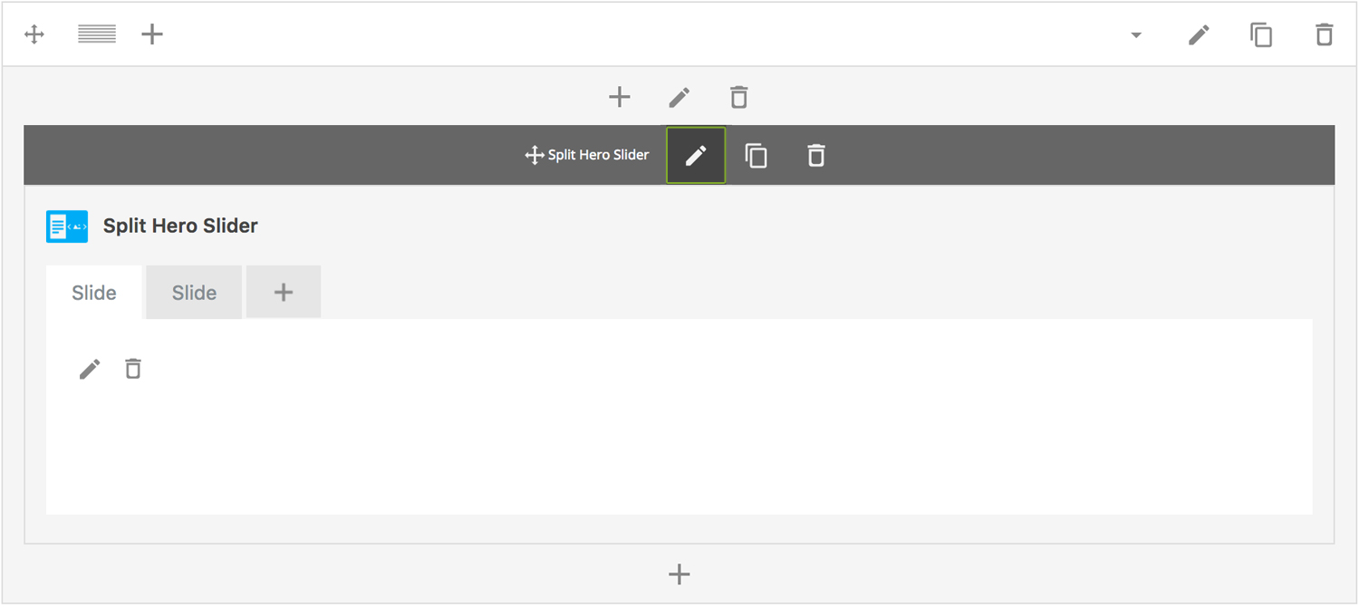
Step 3: Edit Split Hero Slider Section Settings
Once the split hero slider section element has been inserted click the Edit Link(pen icon) of the split hero slider section wrapper, for example:
Here is an overview of available slider section options:
-
Hero Content
Split hero slider content goes here.
-
Height
Determines the starting height of the slider. Possible values include: Regular(500px), Window Height, or Custom Height.
-
Content Media Width
Determines the hero content/slider column split. Possible values include: Split 50/50, Split 60/40, and Split 75/25.
-
ID
Give this section a unique ID. This is useful if you want to initiate scroll or link to this section.
-
Extra Class Name
If you wish to style this component differently, then use the extra class name field to add one or several class names and then refer to it in your css file.
-
Advance Automatically
Determines whether the slider should auto advance from slide to slide i.e. slideshow.
-
Auto Advance Interval
Determines the interval at which the slider will auto advance.
-
Pause On Hover
Determines whether auto advancing should pause upon hover.
-
Progress Bar
Determines whether the interval progress bar should be shown.
-
Navigation Arrows
Determines whether the slider should have navigation arrows.
-
Pagination UI
Determines whether the slider should have pagination bullets.
-
Pagination Color 1
Sets the default pagination color of the slider.
-
Pagination Color 2
Sets an alternative pagination color of the slider. This is useful when you need a darker or lighter pagination for a particular slide.
-
Slider Transition Easing
Determines the easing type of the slider transitions.
-
Slider Transition Speed
Determines the transition speed of slide transition.
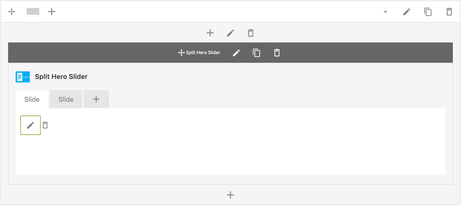
Step 4: Edit Slides
Once you have edited the slider wrapper settings, click the Edit Link(pen icon) of the slide you wish to edit, for example:
Here is an overview of available slide options:
-
Slide Title
Sets the title of the slide.
-
Uploaded Image
Upload slide image.
-
Extra Class Name
If you wish to style this component differently, then use the extra class name field to add one or several class names and then refer to it in your css file.
-
Slide Background Color
Determines the slider background color.
-
Slide Overlay Color
Determines the slider overlay background color.
-
Pagination Color
Determines which pagination color to use.
-
Animation
Determines slide animation type, either Fade, Slide Left to Right, Slide Top to Bottom, Scale In or Scale Out.
Can't find what you're looking for? Submit a request in our forum.