Logos Section
Inserting a Logo Section
Each of our themes come with four predesigned logo sections that offer logos in arranged in 2-6 columns.
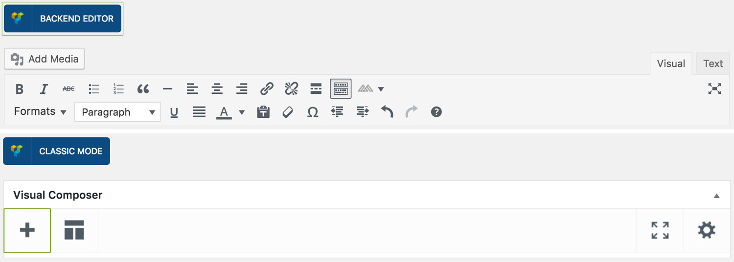
Step 1: Switch To Backend Editor
To insert a logo section, start by clicking the button "Backend Editor" button then click the "+"(Add Element) button, for example:
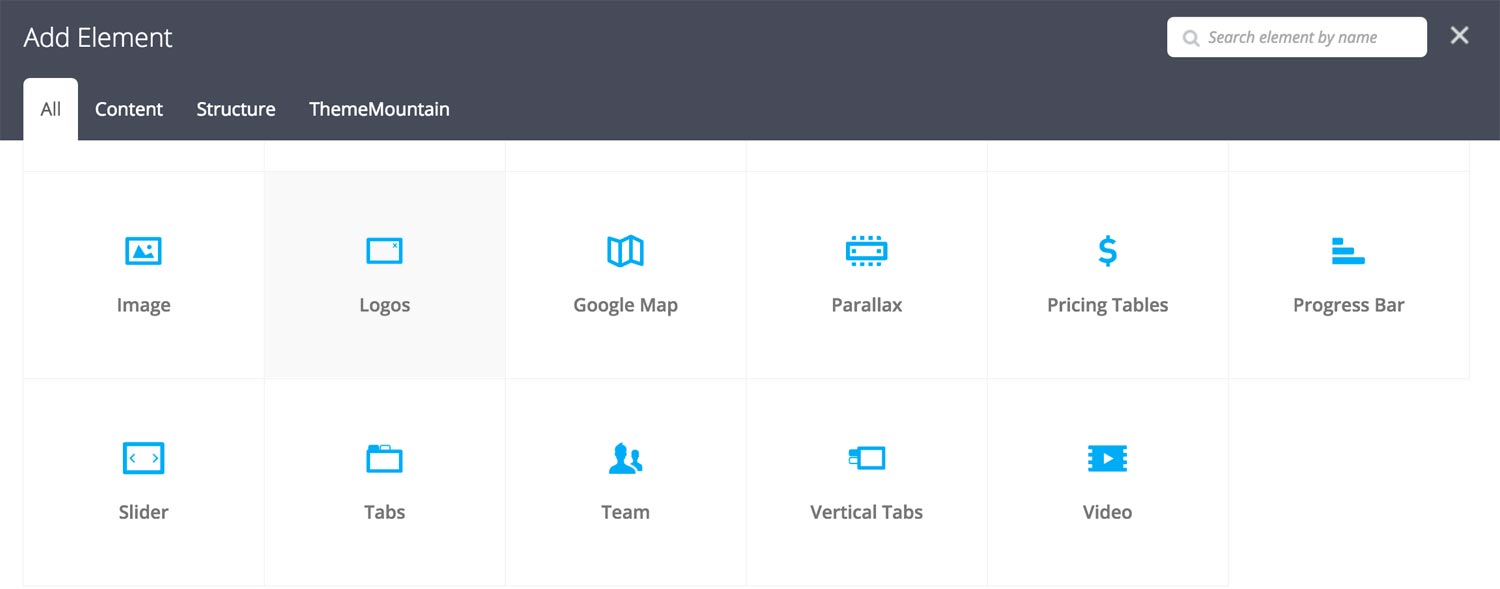
Step 2: Select Logos
Click "Logos" in the Visual Composer Modal to insert a logo section, for example:
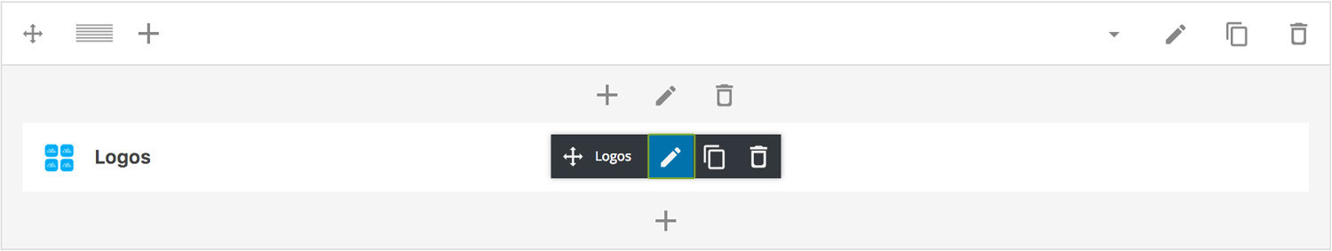
Step 3: Edit Logos Section Settings
Once the logo section element has been inserted click the Edit Link(pen icon) of the logo section wrapper, for example:
Here is an overview of available logo section options:
-
Items Per Row
Determines the number of logos per row. Possible values are 3-6 logos per row.
-
Logo Type
Determines the logos section type, either simple, logo section with background image, logo section with boxed grid, or logos section with dividers.
-
No dependent options.
-
Background Image
Upload background image.
-
Dependent color options (Background Color Logo, Background Hover Color Logo, Border Color Logo (Hover) Close) appear under "Design Options".
-
Dependent color options (Logo Background Color (Hover), Grid Border Color) appear under "Design Options".
-
-
Logos
Upload the logos required for the logos section. Note: Multiple logos can be uploaded at once.
-
Extra Class Name
If you wish to style this component differently, then use the extra class name field to add one or several class names and then refer to it in your css file.
-
Color Options
Background Color
Background Color Logo
Background Hover Color Logo
Border Color Logo (Hover)
Logo Background Color (Hover)
Grid Border Color
Can't find what you're looking for? Submit a request in our forum.